import xlsxwriter
# Create a workbook and add a worksheet.
workbook = xlsxwriter.Workbook('Expenses01.xlsx')
worksheet = workbook.add_worksheet()
# Some data we want to write to the worksheet.
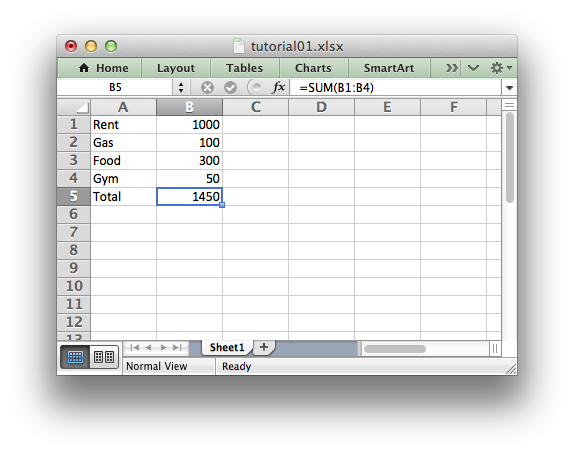
expenses = (
['Rent', 1000],
['Gas', 100],
['Food', 300],
['Gym', 50],
)
# Start from the first cell. Rows and columns are zero indexed.
row = 0
col = 0
# Iterate over the data and write it out row by row.
for item, cost in (expenses):
worksheet.write(row, col, item)
worksheet.write(row, col + 1, cost)
row += 1
# Write a total using a formula.
worksheet.write(row, 0, 'Total')
worksheet.write(row, 1, '=SUM(B1:B4)')
workbook.close()
(출처: https://xlsxwriter.readthedocs.org/tutorial01.html)
#######################################################################
#
# An example of creating Excel Line charts with Python and XlsxWriter.
#
# Copyright 2013-2016, John McNamara, jmcnamara@cpan.org
#
import xlsxwriter

workbook = xlsxwriter.Workbook('chart_line.xlsx')
worksheet = workbook.add_worksheet()
bold = workbook.add_format({'bold': 1})

# Add the worksheet data that the charts will refer to.
headings = ['Number', 'Batch 1', 'Batch 2']
data = [
    [2, 3, 4, 5, 6, 7],
    [10, 40, 50, 20, 10, 50],
    [30, 60, 70, 50, 40, 30],
]

worksheet.write_row('A1', headings, bold)
worksheet.write_column('A2', data[0])
worksheet.write_column('B2', data[1])
worksheet.write_column('C2', data[2])

# Create a new chart object. In this case an embedded chart.
chart1 = workbook.add_chart({'type': 'line'})

# Configure the first series.
chart1.add_series({
    'name':       '=Sheet1!$B$1',
    'categories': '=Sheet1!$A$2:$A$7',
    'values':     '=Sheet1!$B$2:$B$7',
})

# Configure second series. Note use of alternative syntax to define ranges.
chart1.add_series({
    'name':       ['Sheet1', 0, 2],
    'categories': ['Sheet1', 1, 0, 6, 0],
    'values':     ['Sheet1', 1, 2, 6, 2],
})

# Add a chart title and some axis labels.
chart1.set_title ({'name': 'Results of sample analysis'})
chart1.set_x_axis({'name': 'Test number'})
chart1.set_y_axis({'name': 'Sample length (mm)'})

# Set an Excel chart style. Colors with white outline and shadow.
chart1.set_style(10)

# Insert the chart into the worksheet (with an offset).
worksheet.insert_chart('D2', chart1, {'x_offset': 25, 'y_offset': 10})
workbook.close()

(출처: http://xlsxwriter.readthedocs.org/example_chart_line.html?highlight=line%20chart)


 excel_test.py